
Mapping Claim Distribution
After identifying and compiling claims involving women as claimants or administrators, I tallied the number of claims originating in each township to determine their distribution across the province. The resulting dataset is available on the project website. Visualizing this distribution in an interactive map allows users to quickly identify the pattern of women’s claims and explore further into each township’s claims.
All the claims in the sub-collection are mapped by their township, with one major exception. Some claimants provided their location as somewhere along the River Thames, which flows from the headwaters in the interior of the province above London into Lake St. Clair in the Western District. As far as I can determine, there was no township or settlement by this name, so I have grouped these claims together and represented them by a line following the river’s course.
The first step was to prepare the geographic representations for each township, for which I relied on the Heritage Property INdex (HeritagePIN) for Ontario, which includes the rough boundaries of each township in the province organized by present-day county. HeritagePIN does not make its spatial data available for use in other platforms, so I manually replicated the polygonal representations of each relevant township in Neatline. These boundaries are rough approximations that only sometimes match existing geopolitical spaces. Because the townships present in 1812 often determined later boundaries, however, many of the polygons follow existing roads and property lines. In some cases, I verified township boundaries by referencing maps of Upper Canada and its districts from the early nineteenth century.
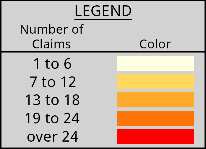
The second step was to assign a color scheme to represent the range of claim numbers for each township. For this step, I used Chroma.js Color Palette Helper, which suggests colorblind-safe palettes based on the number of segments required. The number of claims originating in each township ranged from 1 to 37, with most below 10. I chose a color palette with six segments:
- 1 to 6 claims
- 7 to 12 claims
- 13 to 18 claims
- 19 to 24 claims
- over 24 claims
Based on these segments, each township was assigned a color. Because Neatline is not a spatial data mapping tool, it does not accept or interpret data to style the records presented on the map. Instead, I manually mapped and styled each township. I also created a legend to explain the color scheme and help users understand the patterns on the map.
Upon clicking on any township, users see a pop-up with the number of claims originating in that township and a list of claimant names with links to the corresponding item in the Omeka site. This allows users to quickly explore the townships and access more information about the individual claimants.
This map is the first attempt of which I am aware to plot the spatial data present in the records of the Board of Claims for Losses (BCL). Although previous scholars have collated statistics from the collection, they have not mapped individual claims at any level. It serves to confirm existing conclusions about where the War of 1812 was most disruptive to civilian life. Contemporaries who lived through the war were aware that the Niagara District was a principal battleground and that its inhabitants suffered from the actions fought there. Their views were informed by personal experience, witness accounts, or stories that circulated in Upper Canada. Historians with access to a wider range of sources and a broader perspective have confirmed those early conclusions.
This map demonstrates the concentration of claims for war losses in the Niagara District, further supporting the view that the higher number of military actions in the region caused greater losses and deprivation for its inhabitants. Future studies with an expanded focus that includes all the claims submitted to the BCL might support this perspective but might also suggest alternative interpretations of the war’s impact on civilians in Upper Canada. For more information and discussion of Niagara as a central point in the war, see Module 1 and Module 2.